
10 Steps to Make Your Course Accessible with WCAG 2.0, Part II
by Christine Scherer
Last week, we discussed the first five strategies for improving the accessibility of your online content, as outlined in the OLC and 3PlayMedia webinar. Today, we’ll review the last five tips for implementing WCAG 2.0.
6. Don’t Auto-Play Multimedia
In addition to captions and transcripts, it is important to make sure that multimedia doesn’t autoplay and can easily be paused. Auto-play media can interfere with a user’s ability to navigate through a page, especially if the controls to pause or stop the media are difficult to locate or are not keyboard accessible.
7. Use Accessible JavaScript
JavaScript can be used to increase interactivity on a website. However, using it can result in some accessibility challenges or hindrances. WebAIM identifies the following issues:
Navigation. Inability or difficulty navigating using a keyboard or assistive technology.
Hidden content. Presentation of content or functionality that is not accessible to assistive technologies.
User control. Lack of user control over automated content changes.
Confusion/Disorientation. Altering or disabling the normal functionality of the user agent (browser) or triggering events that the user may not be aware of.
JavaScript accessibility issues do not have a blanket fix—any use of JavaScript on a page must be analyzed and altered on a case-by-case basis. In course sites, this is a concern that should be addressed during the design of a class, while working with the instructional designer.
8. Ensure Keyboard Accessibility
For some users with physical disabilities or who are blind or low-vision, using a mouse to navigate on a website is not an option. Some web content can be navigated using a keyboard to jump between links or menu options. The Tab key moves the selection forward on the page, moving from top to bottom, while pressing Shift + Tab moves it back. Hitting enter activates the selected link. This is one of the easiest accessibility items to test: just unplug your mouse and try to navigate through your site with the keyboard. Could a student using a keyboard to access a video announcement? How about a discussion board?
9. Provide Sufficient Color Contrast
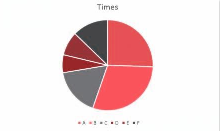
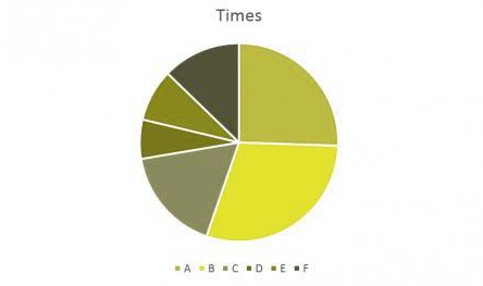
This step is especially important for colorblind users, as well as blind or low-vision users. Ensuring a high degree of contrast between the background and the text is crucial for ease of reading. A light background and dark text is ideal for most users (and makes for an easy conversion for users who need to use in-browser settings to switch to a dark background/light text). In addition, make sure background images used behind the text do not interfere with reading the text. And finally, avoid color-coding in which information is conveyed exclusively through color. For example, take a look at the following pie chart.
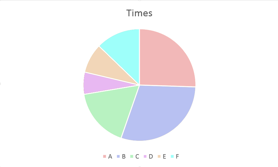
If you’re not colorblind, this image is fairly easy to interpret. However, users who are colorblind might see the chart like this:
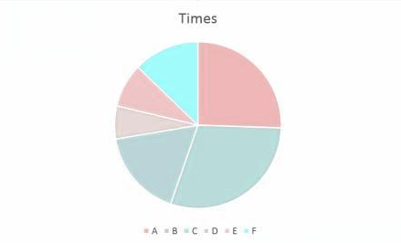
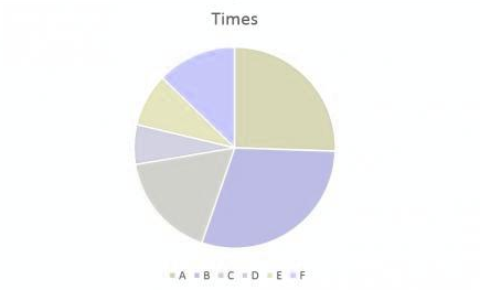
As you can see, while not completely impossible to understand, the colors on these charts are far more difficult to distinguish and will slow down, if not completely stop, a colorblind reader. A chart with sharper color contrast and clear labels can be much more easily understood by all users.
10. Write & Support an Accessibility Statement
Finally, one of the most important things you can do is to write an accessibility statement for your website. W3C has some sample statements on their site. They can be brief and to the point; the key is to tell users what level of accessibility your site is striving for. For example:
Northwestern SPS Distance Learning is committed to ensuring and improving the accessibility of its website for all users. We are working towards bringing all of the pages on our website in line with WCAG 2.0 AA standards. Any issues or concerns should be reported to distanceeducation@northwestern.edu.
However, just having a statement is not enough. Stating your commitment to accessibility is not sufficient if that commitment receives no support. When a user contacts you about an accessibility issue, it needs to be treated as a priority. What may seem like an afterthought or an add-on for some users may be the only way that other users can interact with the content. If an SPS student contacts you about an accessibility issue that you aren’t sure how to address, contact the DL team so that we can start making corrections as soon as possible. In addition, we’re working on drafting a multi-program accessibility statement that we can put on all our Canvas course sites, so that students, faculty, and staff will know exactly who to contact for accessibility support.