
Seeing Differently: Designing for Students With Colorblindness and Low Vision
by Kristina Wilson
Lots of minute decisions govern color selection in design. What colors show allegiance with a university or college? What colors highlight the most important information in an infographic? What colors best distinguish between different types of data?
One question that is rarely asked is, “Are these colors accessible?”
Who Benefits?
Colorblind students see colors differently. This may manifest in many different ways, but are predominantly classified as those with difficulty differentiating between red and green and those with difficulty differentiating between blue and yellow.
Consider taking a colorblindness test or reading more about colorblindness.
Students with low vision often require high-contrast color combinations to be able to read a text easily. Additionally, they may use a variety of assistive technologies to access an online course, including magnification devices like glasses and telescopes and text-to-speech options such as handheld scanners or screen readers. They may also use browser features to enlarge text and images.
Consider using an app like VisionSim to emulate the vision of people with cataracts or macular degeneration, for example.
One way we can serve these students is by considering color use, just one of many facets of web accessibility compliance.
This can seem time-consuming for an instructional technologist, learning designer, or faculty developer who wants to develop a course quickly. Indeed, a common response to concerns about color accessibility is, “How many students could this possibly assist?”
While prevalence of colorblindness varies among different populations, it generally exhibits in 7-10% of men. In the United States, that could mean a minimum of 10.5 million people. The number of people affected by low vision is strikingly greater. 3 in every 4 Americans corrects their vision using glasses or contact lenses, many of them for the first time around age 45, and in 2013, about 7 million Americans were reported to have a visual disability.
Adult students have a higher incidence of disability than the student population at large and are less likely than traditional students to take advantage of accommodations. Anticipating their needs is essential.
Web Content Accessibility Guidelines (WCAG) and Color Selection
When learning to use color in a responsible way, WCAG (Web Content Accessibility Guidelines) 2.0 is a great place to start, particularly in the Perceivable and Understandable guidelines, which include the following rules:
- “Color is not used as the only visual means of conveying information, indicating an action, prompting a response, or distinguishing a visual element.”
Consider how difficult it might be for people who are colorblind to use color-coded maps or graphs like the London Tube map.
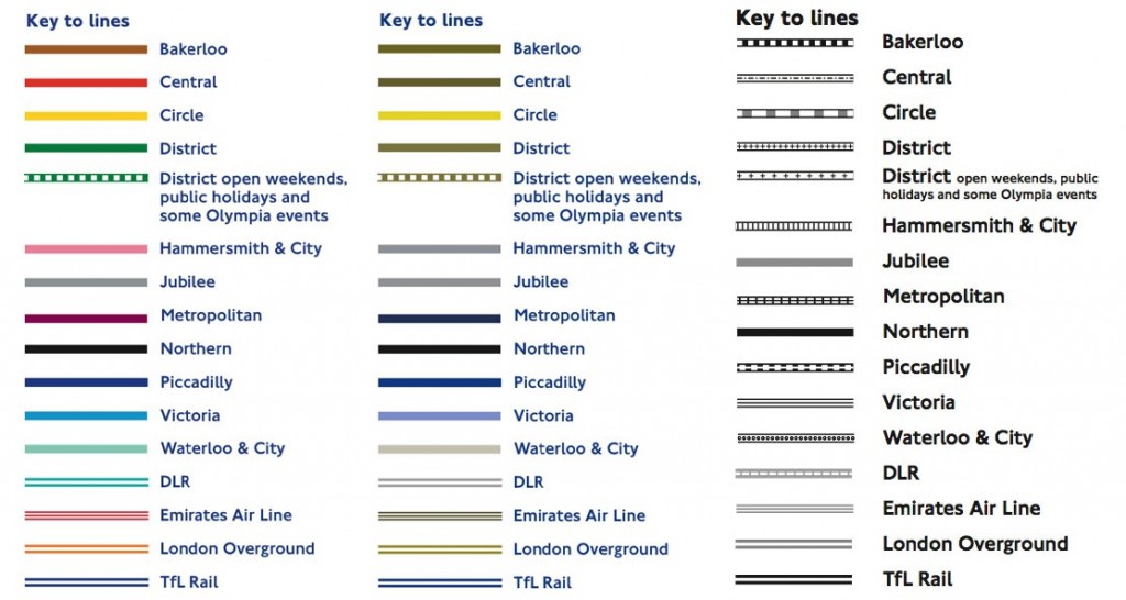
To a person with protanopia-type colorblindness, the Bakerloo, Central, and District lines could be almost indistinguishable. Thankfully, a black and white version that relies on patterns is available.
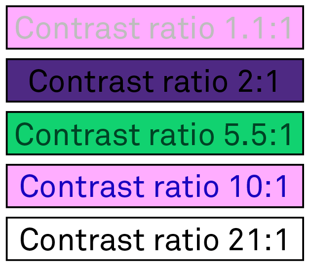
- “The visual presentation of text and images of text has a contrast ratio of at least 4.5:1.”
Text can be difficult to perceive if there is not enough contrast between the foreground and background colors. Black text over a Northwestern purple background, for example, only has a contrast ratio of 2:1.
Built with the assistance of the Accessibility Color Wheel.
Best Practices in Color Selection
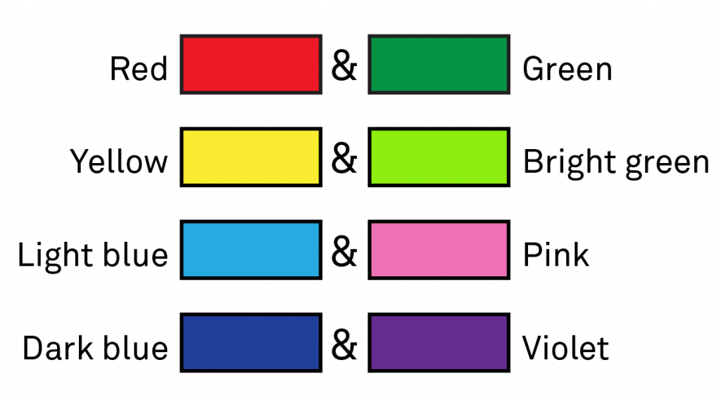
Avoid specific color combinations. There are a number of color combinations that can be difficult to distinguish for students who are colorblind. Here is a handy table to illustrate some of the most commonly confused colors: red and green, yellow and bright green, light blue and pink, and dark blue and violet.
This is how these colors might be perceived by a student with protanopia-type colorblindness.
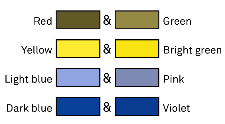
These images were built from tips provided by Adobe.
Choose texture or shape distinctions over color distinctions. This method ensures that no matter how the colors of the bars on the chart or the roads on a map are perceived, they are immediately distinct and identifiable.
Avoid vibrating color combinations. They can produce confusing or uncomfortable afterimages.
Tools
The Accessibility Color Wheel (mentioned above) and Contrast Checker are great interactive tools whether you are developing a new color scheme or determining the success of an existing one.
If you’re considering color from the very beginning of your design work, try the Color Safe webapp, which generates a high-contrast color palette based on your background color, or choose from an established dichromatic color scheme.
Alternatively, if you have already established a color scheme, you can use the Proof Setup feature in Adobe Photoshop CC or Adobe Illustrator CC, which allows you to view your design as colorblind students might.
The Canvas LMS also has a feature called Use High Contrast Styles that can convert existing course content to high contrast content. To enable it (either for your personal use or to see how it appears to students):
- Click Account in the Global Navigation bar and then click Settings.
- Click on the pencil icon to Edit Settings.
- Scroll down to Feature Options – Use High Contrast Styles and toggle the on-off button to On.
- Don’t forget to click Update Settings to preserve your changes!
Guidance
For assistance selecting an accessible color scheme or bringing the colors used in your course into compliance, please do not hesitate to contact Christine Scherer or Krissy Wilson.
Thank you for sharing this useful information. This seeing differently designing for students with colorblindness and low vision is very great information and images also very clearly visible. It’s really helpful for me and I found some information about color blindness, nowadays many people have color blindness problems so if any have color blindness problems then go here and check them all by the screening test.